Dornob | Design Ideas Daily |
- Urban Park Bench Transforms Into Temporary Homeless Shelter
- Tiny Apartment Gets Large Look With Partition Additions
- Simple Design Tweak Takes the Yuck Out of Kitchen Sinks
- Virgin Atlantic’s Lighter, Smarter, Redesigned Meal Trays
| Urban Park Bench Transforms Into Temporary Homeless Shelter Posted: 17 Jun 2014 02:00 PM PDT
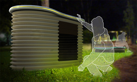
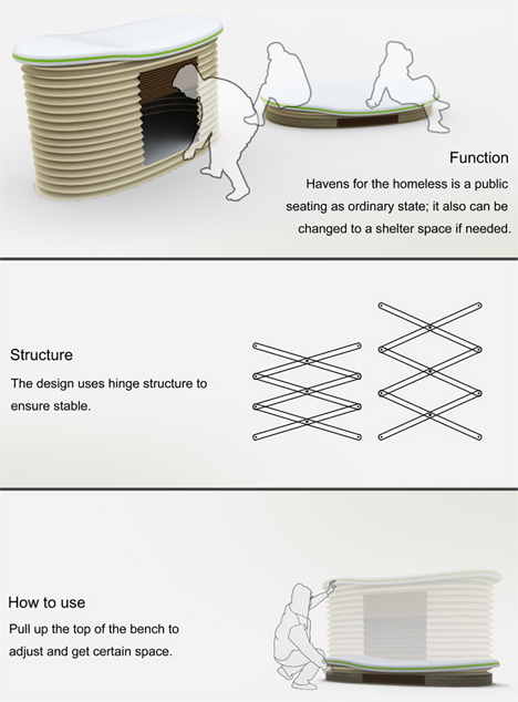
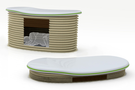
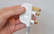
Homelessness is a community problem that exists nearly everywhere in the world. Rather than punishing the homeless or chasing them away from their regular sleeping spots, more and more communities are instituting programs to help the homeless population. This concept from designers Ke Wan, Xiaohua Ma, Xing Guo & Qingxiang Zhu is called Homeless Haven, and it is meant to do double duty as daytime park furniture and nighttime shelter.
The objects are low park benches in daylight hours; later, their tops lift up via a scissor-like hinge and lock into place, creating a small sleeping space inside. People who need shelter for the night can climb into the den-like area and curl up for a good night’s sleep. While it isn’t as comfortable as a bed, the transforming bench does provide some shelter from the elements.
The drawbacks of the Homeless Haven are the same that plague other outdoor sleeping arrangements: there is a high probability that users can be harassed, abused, or stolen from as they sleep in the door-less chamber. The likelihood for vandalism is high as well, but these risks would hopefully be outweighed by the positive aspects of the Homeless Haven if it should ever be made into a reality. Keep Going - Check Out These Great Related Dornob Articles: |
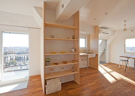
| Tiny Apartment Gets Large Look With Partition Additions Posted: 17 Jun 2014 08:00 AM PDT
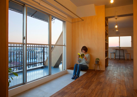
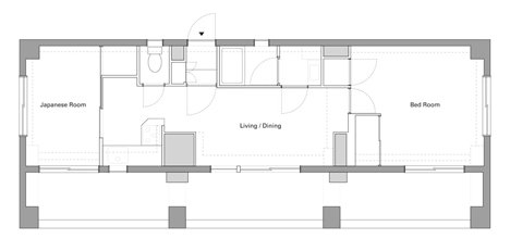
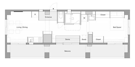
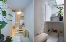
A tiny apartment in Nishitokyo-shi, Tokyo was in serious need of a makeover. Its 50 square meter (164 square feet) area was filled with plenty of sunshine, but the flow of the home seemed wrong: a bedroom on one end, kitchen/dining room in the middle, and Japanese room at the other end.
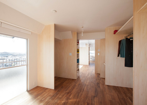
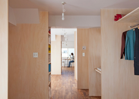
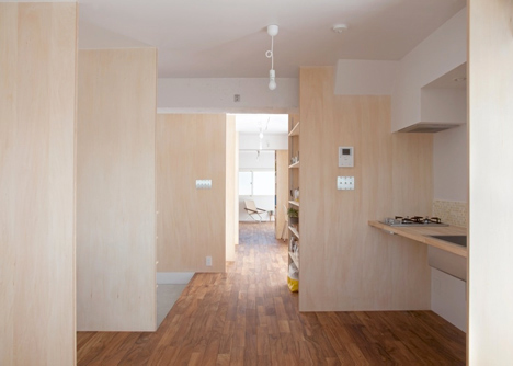
Architectural design firm Camp Design, Inc. rearranged the Wing Wall House’s functions and added a series of wooden partitions to create a series of segments and mini-rooms. It is truly amazing how a simple reprogramming of an existing space can transform the entire look and feel of the home.
The flow of the apartment was made more intuitive and natural: bedroom at one end; kitchen, bathroom, and small study area in the middle; and living/dining area at the other end. (Above: the old floor plan on top and the new floor plan under it.)
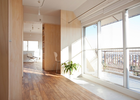
The wooden partitions create visual separations of space without crowding the apartment or making the already-tiny space seem smaller. Natural light from large windows and a large sliding glass balcony door fill the home with sunshine and a perceived sense of space.
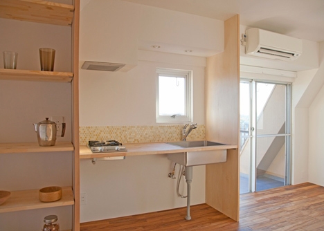
Wooden shelving units blend in with the added wooden partitions to create a small storage space in the kitchen area. A study nook sits to one side of the balcony while a doma, a traditional Japanese raised area, occupies the other side. Keep Going - Check Out These Great Related Dornob Articles: |
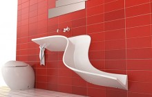
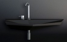
| Simple Design Tweak Takes the Yuck Out of Kitchen Sinks Posted: 16 Jun 2014 06:00 PM PDT
Disposing of the soggy, smelly debris that gathers at the bottom of the kitchen sink is one of the worst parts of cleaning. Even if you have the type of sink strainer with the handle that sticks up from the middle, there’s no telling what kind of nastiness is going to be clinging to that handle – and then there’s the holding it by the edges and tapping it against the side of the trash can to empty it.
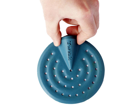
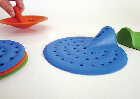
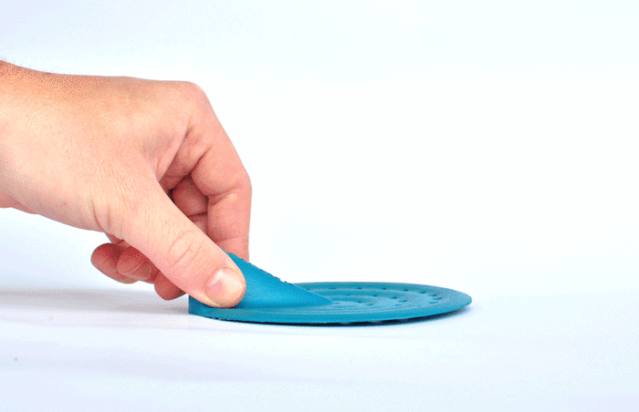
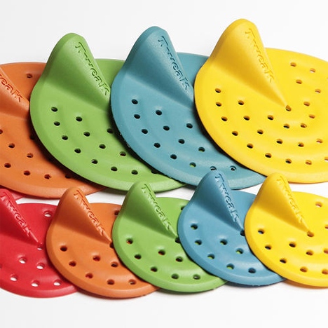
Designers Nitzan Shafat and Aviv Rozenfeld came up with the idea for Tweak while students at Shenkar College of Engineering and Design in Tel Aviv. The small silicon device covers up the drain and features a small handle protruding from one side. Yucky stuff gets caught in the middle of the strainer, leaving the handle clear.
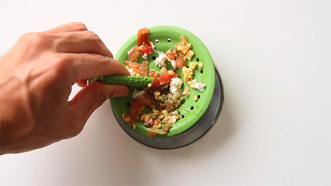
To dump the sink debris, you just pinch the little handle and the Tweak turns inside-out. Then it’s easy to dump the disgusting remains of past meals right into the garbage without ever having to touch them directly.
There’s a smaller bathtub version as well, which is intriguing because it addresses an issue that plenty of households face: bathtub drains clogged with long hair. The Tweak catches all of the hair that comes out while you shampoo in the shower, resulting in your having to dump toxic clog-clearing chemicals down the drain far less often.
It seems that there has been a general consensus about the brilliance of the Tweak: the product’s Kickstarter project has raised many times its goal. And really, the product is exactly what it says it is: a small tweak to a familiar design – one that happens to make life just a little bit less icky. Keep Going - Check Out These Great Related Dornob Articles: |
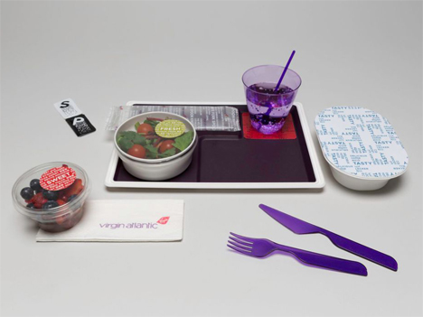
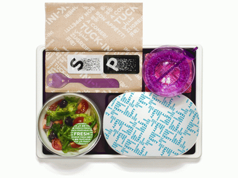
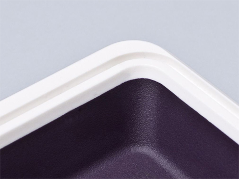
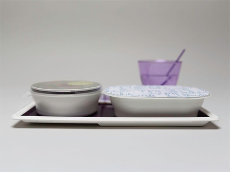
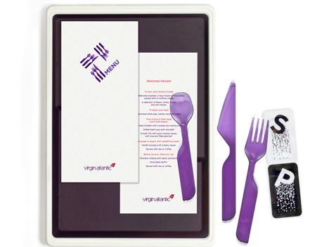
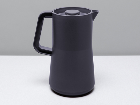
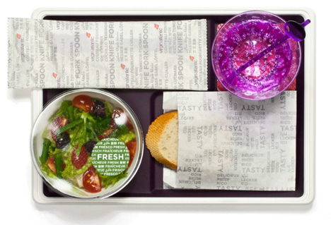
| Virgin Atlantic’s Lighter, Smarter, Redesigned Meal Trays Posted: 16 Jun 2014 02:00 PM PDT
When you’re taking thousands – or even hundreds of thousands – of pounds of equipment and passengers up into the air, you want to lighten the load in any way you can to save fuel. Virgin Atlantic commissioned British design firm MAP to come up with a new design for their in-flight meal trays. The reason for the redesign was twofold: to reduce the flight weight of the plane and to make the in-flight dining experience more like table service at a fancy restaurant on the ground.
MAP designers took some flights with Virgin Atlantic crews to see firsthand how flight attendants transport and serve meals on moving planes. They listened to flight crews and observed the serving process, then used the information to design and complete a $168 million redesign of the entire in-flight meal experience.
The airline’s meal trays have been reduced in size to take up approximately 25 percent less space on a flight. After the designers noticed that food was slipping around in the trays and becoming smooshed and scrambled, they added non-slip pads to keep every morsel in place. Each meal tray has a lip on it that hooks over the following tray so that when one tray is pulled out the next comes up to the edge of the cart. This way, the attendants don’t have to bend over and reach into the cart to retrieve the next meal.
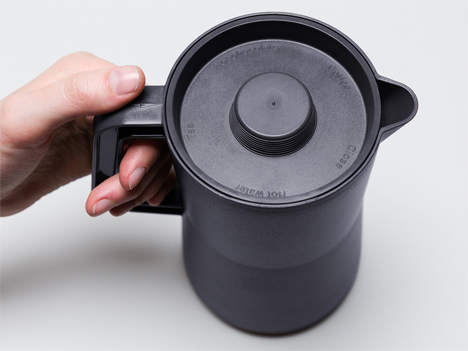
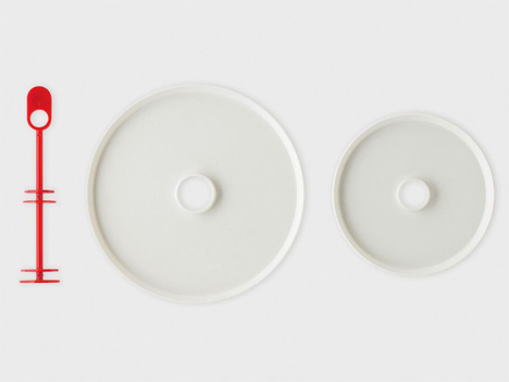
Coffee and tea carafes were redesigned to be lifted from above, contributing to a greater efficiency of movement. The lids were also redesigned with molded text indicating what each one contains, preventing flight attendants from using unreliable methods like writing on the carafes with Sharpies.
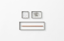
The first-class meal service redesign was a little more involved; the designers created two-level serving trays which can snap together in a matter of seconds. The two-level tray lets the flight attendants serve a sandwich and a piece of cake at the same time, eliminating the need for an extra trip. Overall, the meal service redesign reduces the weight of each flight by approximately 291 pounds. That may not sound like much, but when you fly as much as Virgin Atlantic does, the weight savings add up to millions of dollars every year. (via: Wired)Keep Going - Check Out These Great Related Dornob Articles: |


| You are subscribed to email updates from Dornob To stop receiving these emails, you may unsubscribe now. | Email delivery powered by Google |
| Google Inc., 20 West Kinzie, Chicago IL USA 60610 | |